Kengo Kuma is one of the most popular architects worldwide. His firm, Kengo Kuma and Associates, has offices in Tokyo and Paris.
The company has done over 300 projects in 20 countries since its inception in 1990. Kengo is famous for his unparalleled ability to harmonize architecture with nature and society.
Table of Contents
The Kengo Kuma Philosophy
According to Kengo Kuma, good architecture is like good sushi. Both require the best materials from the best regions to stand out from the competition.
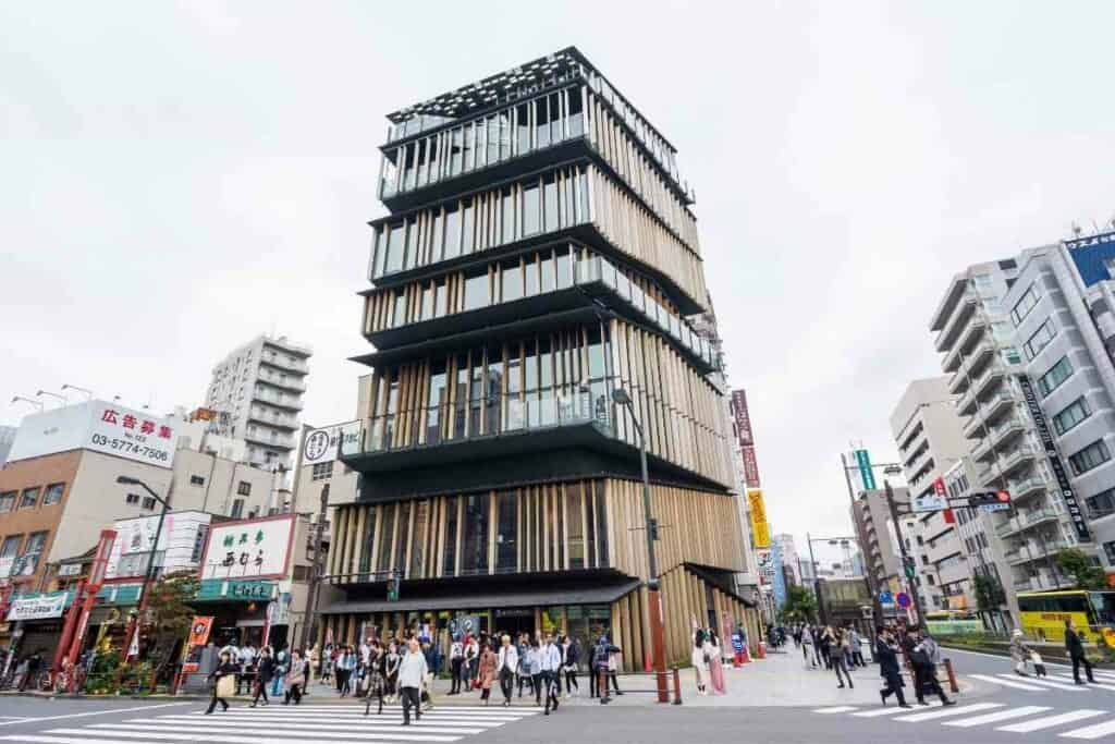
His style focuses on making buildings from local and ancient materials, crafted and assembled with respect to the landscape.
Kuma’s ideologies stem from his time of birth and educational path.
He was born in 1954 and grew up in postbellum Japan, as the country was experiencing an economic surge.
He pursued his undergraduate degree in architecture at the University of Tokyo.
During his graduate research at Columbia University, he met Kenneth Frampton, a renowned architectural historian.
Frampton’s thesis on the relationship between architectural designs and the geographical context of the building’s site formed the basis for Kuma’s philosophy.
After His Research – He returned to Japan and started his firm. The idea that the best architectural designs are attainable through the manipulation of the senses – light, sound, and even scent – has been the core of Kuma’s practice from its beginning.
It’s why he uses the materials used in traditional Japanese construction, such as bamboo, ceramic, stone, and wood, as the main form of visual expression in his designs.
Kuma believes contemporary architecture focuses too much on concrete, glass, and steel, cutting the connection between people and nature.
Instead, using traditional Japanese materials, Kuma reconnects humans to nature and helps solve global environmental challenges.
The Most Outstanding Kengo Kuma Buildings
Here are must-see Kengo Kuma buildings around the world.
1. V&A Dundee, UK
V&A Dundee is an annex of London’s Victoria and Albert Museum located in Dundee, Scotland.
It differs from most Kengo Kuma buildings because it’s in a traditionally cold area, while most of his architectural works are in warm regions.
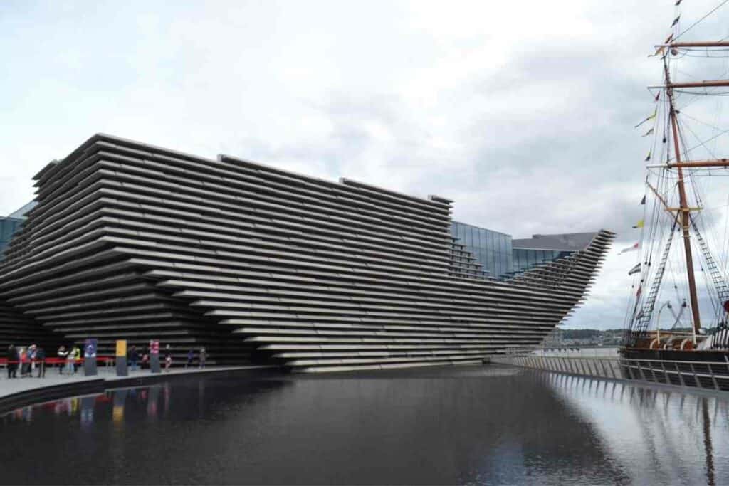
Despite its rough outlook, this museum has visually stunning geometry.
Outside, the museum has sharp and angular edges, typical of Kengo Kuma’s style.
The building has a hole resembling a cave connecting pedestrians from the city to River Tay’s estuary at the North Sea.
Such holes are a common fixture in Kuma’s architecture – he views them as connectors, drawing inspiration from Japanese torii gates found at the entrances of Shinto shrines.
The hole in this museum also doubles as an entrance. It leads into a large foyer hosting concerts and other public functions.
Because of its popularity, locals refer to the foyer as the Dundee’s Living Room.
2. Japan National Stadium, Tokyo
When Japan won the bid to host the 2020 Olympics, the government hired Zaha Hadid, a British-Iraqi architect, to design the stadium.
She proposed a neo-futuristic stadium that the government would later scrap because of its colossal costs.
So Kengo Kuma was Hadid’s replacement, tasked with coming up with a cheaper design, and he did it!
Kengo decided to build a stadium better than Kenzo Tange’s 1964 Olympic Stadium, a design he revered throughout his childhood.
Instead of going for Tange’s monolithic design or Hadid’s futurism, Kuma chose traditional Japanese architecture.
He focused on the Meiji Jingu forest, next to the forest’s locale. Moreover, the stadium is low to the ground to avoid standing out.
This is in tandem with Kuma’s principles that skyscrapers are embarrassing.
The Olympic Stadium uses wood sourced from the 47 prefectures in Japan, a symbol of national unity.
3. Asakusa Culture Tourist Information Center, Tokyo
The ACTIC (Asakusa Culture Tourist Information Center) is a must-see destination for everyone who visits the Land of the Rising Sun.
It’s a modern iteration of the Senso-Ji pagoda near the famous Kaminari-mon Gate at the temple’s entrance.
Like other Kengo Kuma architecture, this building features extended eaves and spaced louvers.
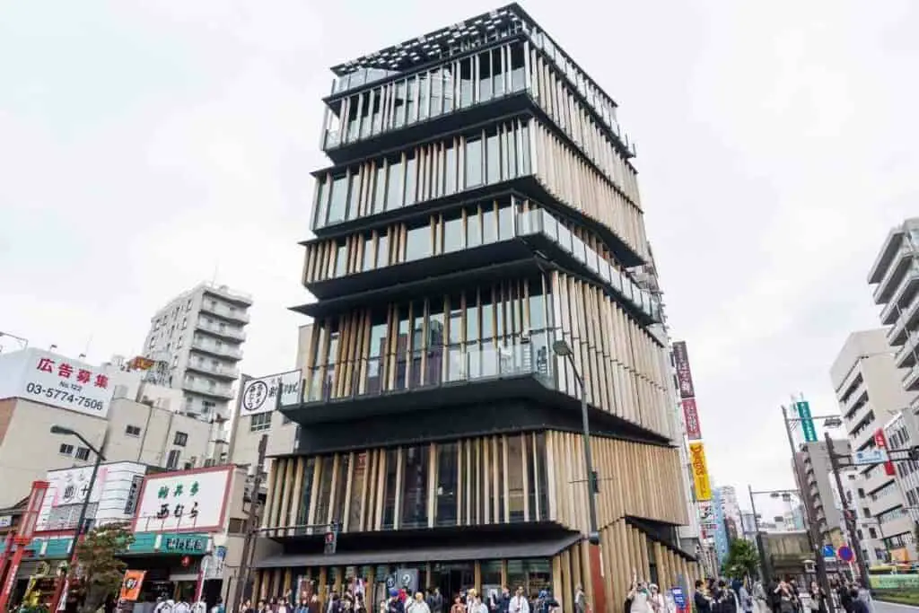
Its overhanging roofs make the building look like seven buildings layered on each other.
Each louver has random wooden lovers, giving an organic look to buildings with symmetrical patterns.
As a Result – Kuma designed this building to be attractive and didn’t miss a bit. Its traditional design makes it stand out among ultramodern designs, but it isn’t so different that it looks out of touch.
4. Yusuhara Market
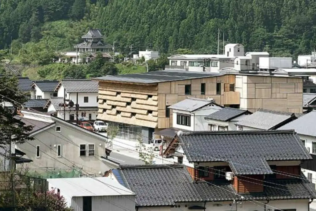
In a somewhat dull and quiet town with a little over 3,500 people, the Yusuhara Market brings the city to life.
The market complex, known as Yusuhara Machino-eki, sells local products and has a small 15-room hotel.
Despite its small population, Yusuhara is famous because of its proximity to the highway used by Sakamoto Ryoma, a popular local warrior who contributed to the start of the Meiji Restoration.
The road also has several restrooms that offer free tea to travelers.
The rooms, called ‘Chad Do,’ are the main inspiration behind the market’s design, as they connect the past to the present.
The building’s lower part is made of glass. On top of the glass is a pile of straws forming a curtain wall.
The roofing is thatched – however, it’s different from typical thatched roofs, as the thatches are fixed horizontally to the foundation instead of vertically.
As a result, the cut ends aren’t exposed to rainfall, increasing their durability.
The interior consists of cedar tree logs and some astringent skin. The remnant astringent skin comes from a controlled bark peeler fortified with other materials to add to the texture.
The objective was to create a building with a rough surface matching the characteristics of the Yusuhara township.
5. Portland Japanese Market, United States
The Portland Japanese Market is undeniably the most authentic Japanese garden outside Japan.
The garden, which opened in 1967, was expanded years later by Kengo Kuma to increase its capacity and authenticity.
Kuma based the market’s design on monzemachi, the gate-front towns that lead you into traditional Japanese shrines and temples.
One of Kuma’s additions to the market was the Cultural Village, which has three buildings surrounding a courtyard, a group of structures that blend seamlessly with the environment.
Like most Japanese architecture, these buildings have double-tiered and hipped roofs.
The upper levels of the roofs have local vegetation that corresponds with the landscape, while the lower levels shield against the torrential rains from the Pacific Northwest.
Originally – Designers chose natural wood forms and lovers as the exteriors for this market. Thin and tapered eaves were the preferred choice for the roofs.
However, these were abandoned due to impracticality. Instead, builders used aluminum panels with a finish that resembled textured natural material.
In addition, aluminum presented a lighter and more manipulable option than wood.
6. The Exchange, Sydney, Australia
Kengo Kuma designed the Exchange to be the centerpiece of Darling Square, a suburb on the western outskirts of Darling Harbour in Sydney’s central business district.
His objective was to develop a building that was recognizable from all angles.
As a result, the final blueprint was a building with circular geometry, accessible and recognizable from all directions. Even better, the structure is connected to society.
The Exchange features six curved floors enveloped by angular walkways.
A wooden screen covers the building’s exterior, creating a dynamic and interesting view highlighting Darling Harbour’s prominence as a market exchange and a business hub.
Inside, the Exchange has a childcare center, a library, a market hall, and an innovation hub for start-up technology entrepreneurs.
The rooftop houses a bar and restaurant that provides uninterrupted views of the Chinese Gardens, Cockle Bay, and Tumbalong Park.
Currently – The Exchange is undergoing a renovation that would become home to over 4,000 people and create employment for over 2,000.
7. Starbucks Reserve Roastery, Tokyo
The Starbucks Reserve Roastery in Tokyo is another addition to Kengo Kuma’s long list of architectural masterpieces.
Its standout feature is the origami ceiling which offers clients an unrivaled luxurious experience.
The outlet is one of the five Starbucks Roasteries worldwide, with others in Milan, New York, Seattle, and Shanghai.
Starbucks Roasteries are different from the company’s typical coffee shops – they offer premium customer service, with a chance to sip unique coffee recipes.
The Tokyo Roastery in Nakameguro aims to match traditional Japanese crafts and landscape.
It’s a four-story building with overhanging ‘fins’ on its facade, aimed at accommodating balconies.
The café’s entrance has a huge copper coofer+bean cask that anchors it and extends upwards to the top floor.
The entire building is cylindrical and has a mottled surface made by tsuchime, a technique that uses a small hammer to create patterned indentations.
Kuma opted for an open plan on the ground floor, aiming to create an immersive experience for the customers.
Besides the customary chairs and tables, there’s a small section selling Starbucks merchandise and popular Italian pastries like Cornetto and Focaccia.
The floor and walls are grey, while the ceiling has triangular striped wood that looks like origami paper.
Beyond the ground floor, the aesthetic continues. The first floor has a menu exclusive to various Japanese teas.
On the Other Hand – The second floor has a cocktail bar called Arriviamo, the home to Tokyo’s best coffee-infused martinis.
The Starbucks Roastery at the very top hosts the Amu, a spacious lounge that means ‘knit together in English.
The lounge, currently used for hosting conferences and get-togethers, is earmarked to become a training center for aspiring coffee connoisseurs.
8. Odunpazari Modern Museum in Eskisehir, Turkey
The Odunpazari Modern Museum was constructed to house the modern art collection of Turkish contractors.
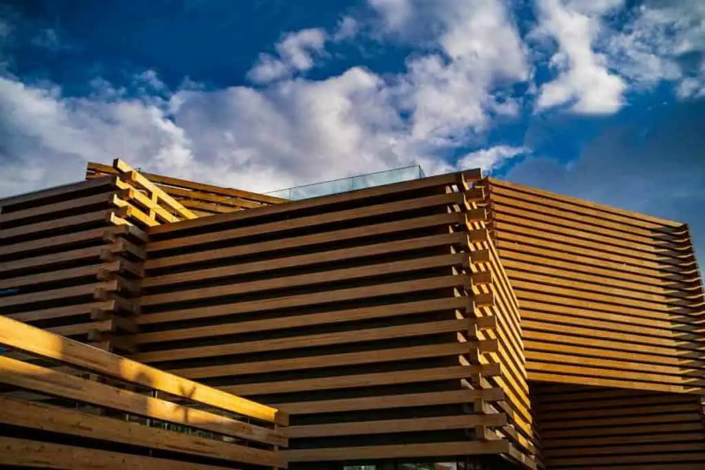
The iconic building looks like a structure of boxes made using interlocking and stacked timber beams.
Odunpazari means firewood market in Turkish. The town, which used to be a timber trading center, formed the basis for Kuma’s design.
When designing the museum, Kuma and his associates focused on an outcome that would reflect the town’s heritage.
Furthermore, timber gives off comfort and warmth without the destructive effects of metal and glass.
Another aspect that inspired the museum is the unique design of the adjacent Ottoman buildings.
To provide a contrasting design, Kuma and his associates used stacked wood.
Overall – The museum aims to match the architectural designs of the nearby streets such that you don’t feel that you’re in a different setting when you visit.
Lower floors have small rooms to provide more intimacy, while upper floors are more spacious to host public events and exhibitions.
The center of the building has a sky-lit atrium that stretches across all floors of the three-floored building.
It features a timber lining that twists gently as you rise through the floors.
Next to the museum is a large plaza that connects to the building. According to Kuma, this connects people to art.
9. M2 Building, Tokyo
The M2 is perhaps the most infamous piece of work in Kengo Kuma’s portfolio.
It explains why it isn’t featured in his many books.
Also, the architect has severally admitted that he feels embarrassed that he came up with such a design. Why?
The M2 is fundamentally different from other Kengo Kuma works. It’s an ultramodern design that contradicts the tradition and rusticity associated with Kuma’s works.
Simply Put – It’s the antithesis of his lifelong reputation. Unlike most of his works, the M2 is a huge concrete, glass, and steel structure.
Instead of being in harmony with nature, it’s the complete opposite – a combination of disparate ideas mashed together to create a building.
At its inception, the M2 was a Mazda dealership. Unfortunately, it’s currently a mortuary, an indicator of how much it has fallen.
Regardless, it’s still good, judging by postmodern architectural standards. However, you wouldn’t look at it twice if you’re an ardent Kengo Kuma fan.
Wrapping Up
In a world dominated by Dubai’s skyscrapers and other megastructures, it’s hard to imagine a place for designs that focus on nature, such as Kengo Kuma’s.
However, these nature-inspired designs are timeless, affordable, and, more importantly, sustainable.
It’s no coincidence that The Time considers him one of the world’s most influential personalities.
Also Read
- 12 Things Tourists Should NEVER Say in Japan
- Kissing Robot: Exploring the Popularity of the Chinese Kissing App
- Unlocking the Secret Dating Rituals Only Locals Know in Japan
- Samurai Armor: Ancient Protection for Japan’s Elite Warriors
- 10 Amazing Facts About Schools in Japan: Unique Traditions and Educational Practices
- Where can you see snow monkeys in Japan: Best locations and viewing tips
